The problem
To book an appointment, patients must have a Best Health account. Users found the sign-up long and confusing. Hotjar recordings and user interviews showed the old journey jumping through six stages: picking a time, an unexpected login, setting up an account and verifying email, verifying a mobile number, creating the account, and then a separate form asking for details they'd already given.
"I already gave you my details, you know who I am."
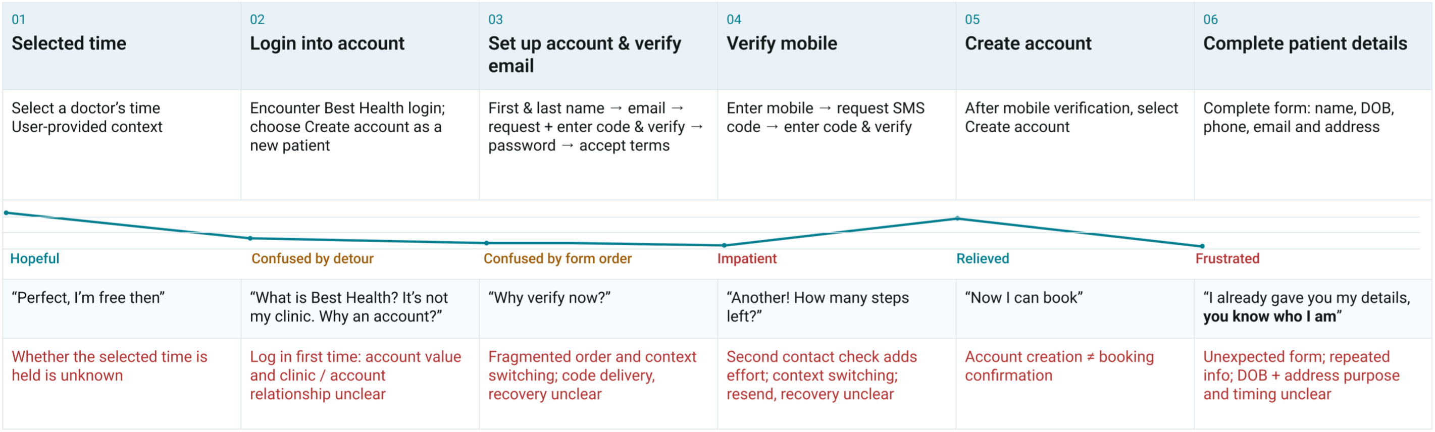
| Step | Patients felt | What they said | Pain point |
|---|---|---|---|
| 1. Selected time | Hopeful | "Perfect, I'm free then" | Whether the selected time is held is unknown |
| 2. Login into account | Confused by detour | "What is Best Health? It's not my clinic. Why an account?" | Account value and clinic / account relationship unclear |
| 3. Set up account & verify email | Confused by form order | "Why verify now?" | Fragmented order and context switching |
| 4. Verify mobile | Impatient | "Another! How many steps left?" | Second contact check adds effort |
| 5. Create account | Relieved | "Now I can book" | Account creation ≠ booking confirmation |
| 6. Complete patient details | Frustrated | "I already gave you my details, you know who I am" | Unexpected form; repeated info |
What I did
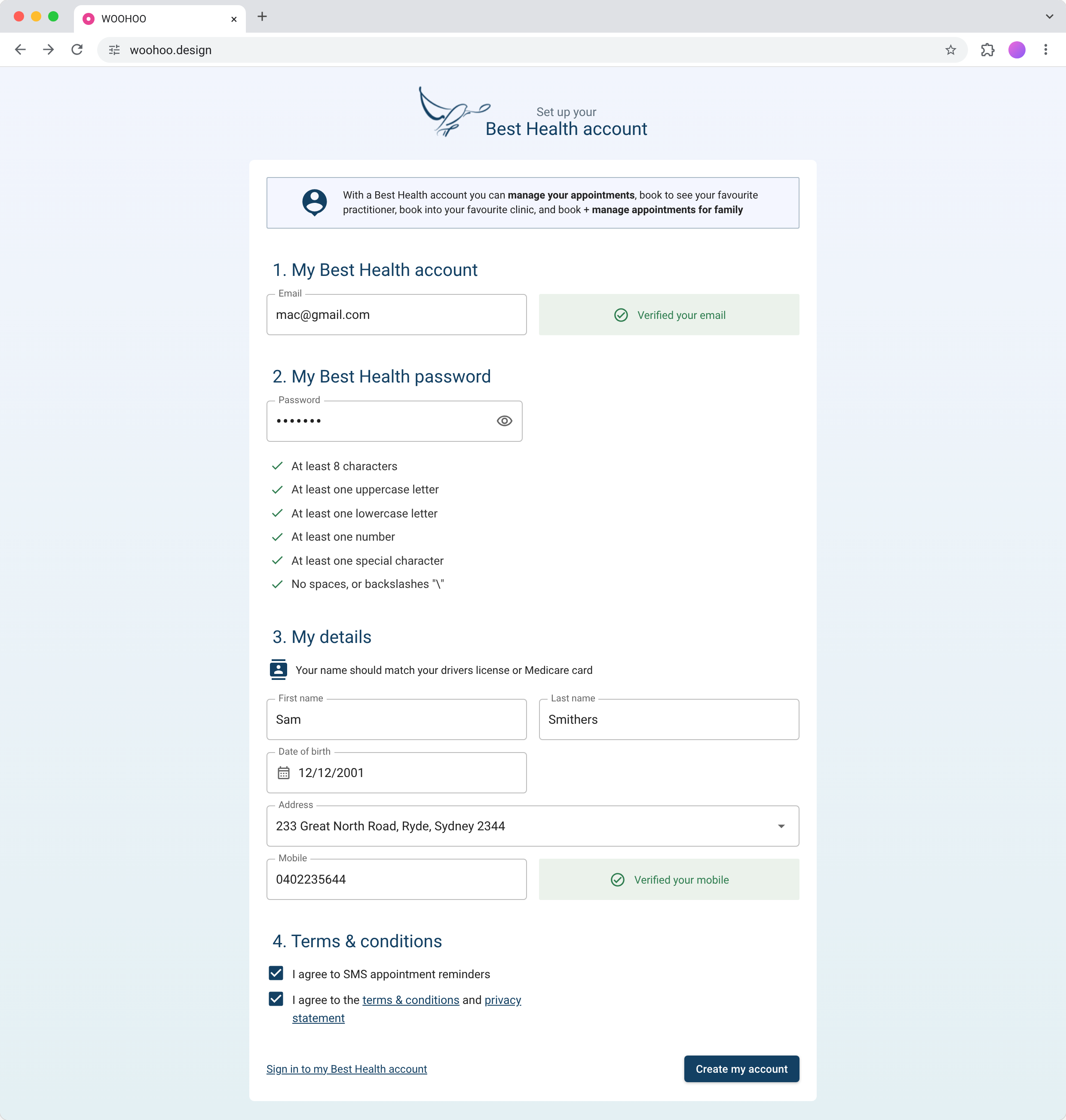
I redesigned sign-up as one guided flow, built around progressive disclosure, so patients always know what's next and why it's needed.
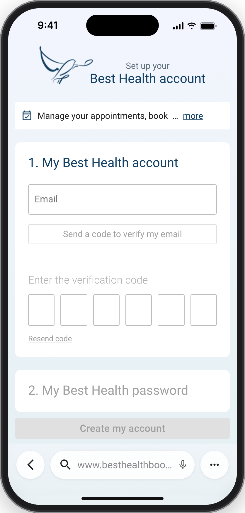
- Explain the value up front. A short panel says what an account is for (managing appointments, booking for family), encouraging patients to manage their own bookings rather than call the clinic.
- Clear numbered sections. Headings and copy link each step to the information it needs.
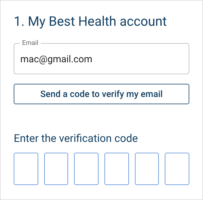
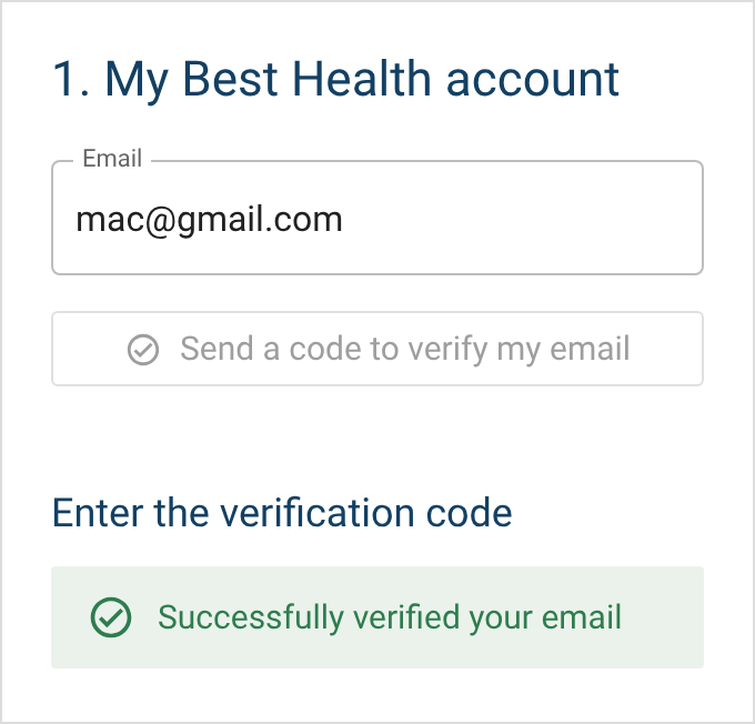
- Verification in place. Email and mobile are verified inline with clear success states, following established MFA patterns.
- Ask once. Address and date of birth are gathered during sign-up, which removes a screen from booking.
- A calmer look. A modern, soothing palette suited to health software, for people who may be feeling unwell.
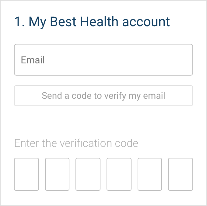
Entry
Email verified
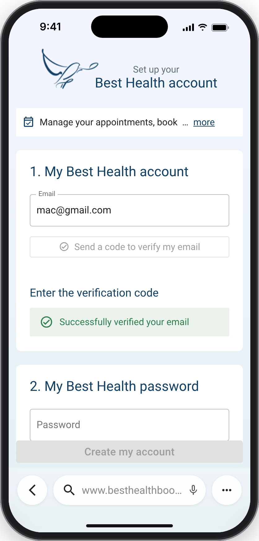
Outcome
The redesign tested well in moderated usability testing. Together with the booking fixes, it removed 2 steps and reduced drop-offs.
How I'd use AI now
This project was done before AI tools were part of my process. If I did it today:
- Use AI to sift Hotjar recordings and interview transcripts for where people hesitate or give up, and draft the first journey map from them, then check every step against the evidence.
- Build the flow as a working coded prototype in a day, so testing uses real interactions (verification codes, password rules) rather than static screens.
- Draft the tone and helper text in several versions and test the strongest against each other.
- Keep patient details out: anonymise recordings and transcripts before any AI tool sees them.