Why
Designers across several B2B and B2C products needed one place to find components, and engineering needed design colours to match the code exactly. I set out to create and manage a comprehensive library of our internal design assets, aligned with development's.
What I did
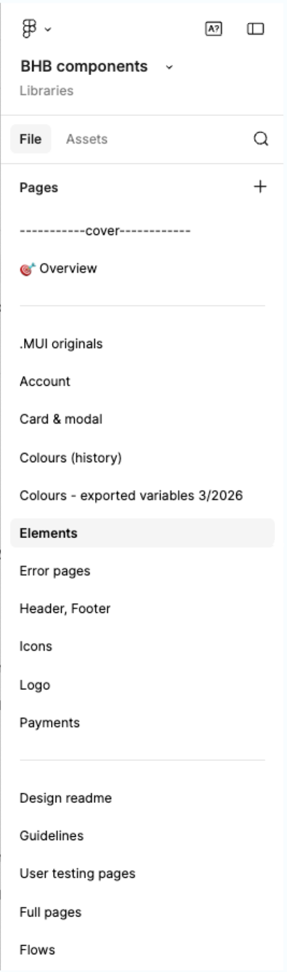
- Clear structure. Pages are labelled to be used across the organisation, with a design readme, guidelines and user-testing pages alongside the components.
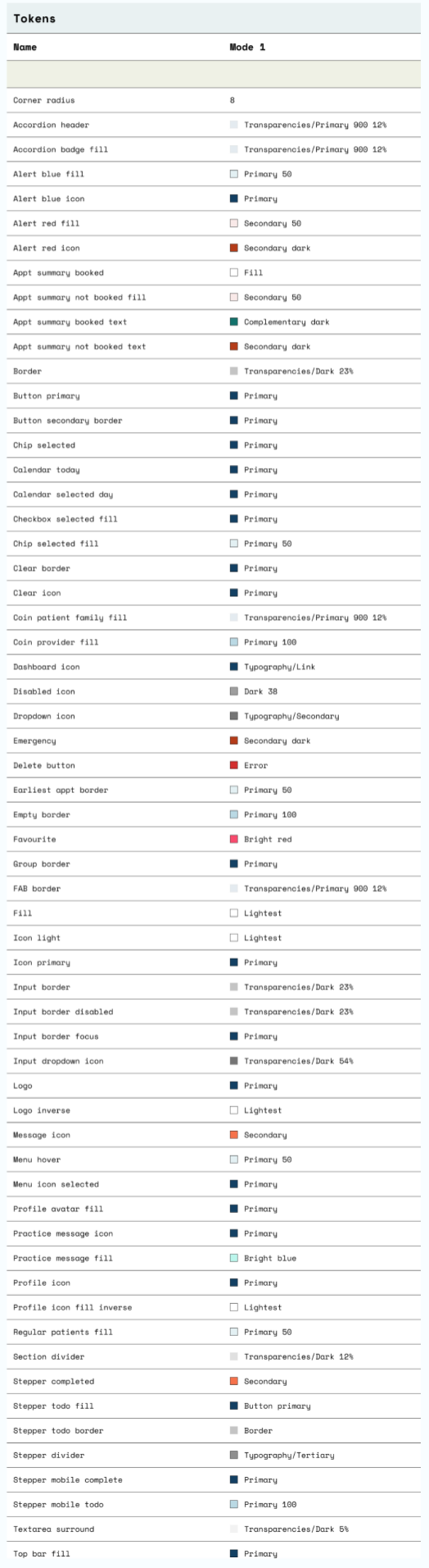
- Tokens for development. Every variable colour is labelled and referenced in tokens. I worked with development to standardise and match the colours.
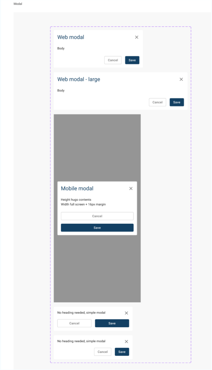
- Transparent naming. Other designers can quickly find components and variants, which makes their design process more efficient.
- Coaching. I coach junior designers in using the library well, from naming and structure to when a new component is worth adding, so good practice spreads beyond me.
Outcome
Better output and hand-over, and consistency across B2B (mobile, web) and B2C (web) products.
"Rachael is amazing with file system. Who is going to look after the file structure when you are gone?!?!"
How I'd use AI now
This project was done before AI tools were part of my process. If I did it today:
- Keep Figma and code in sync automatically: flag components or tokens that drift between the design library and the codebase.
- Generate component documentation and usage guidance from the library, so it stays current without someone writing it by hand.
- Turn designs into coded components faster with AI, then review them against the tokens and accessibility rules.