The problem
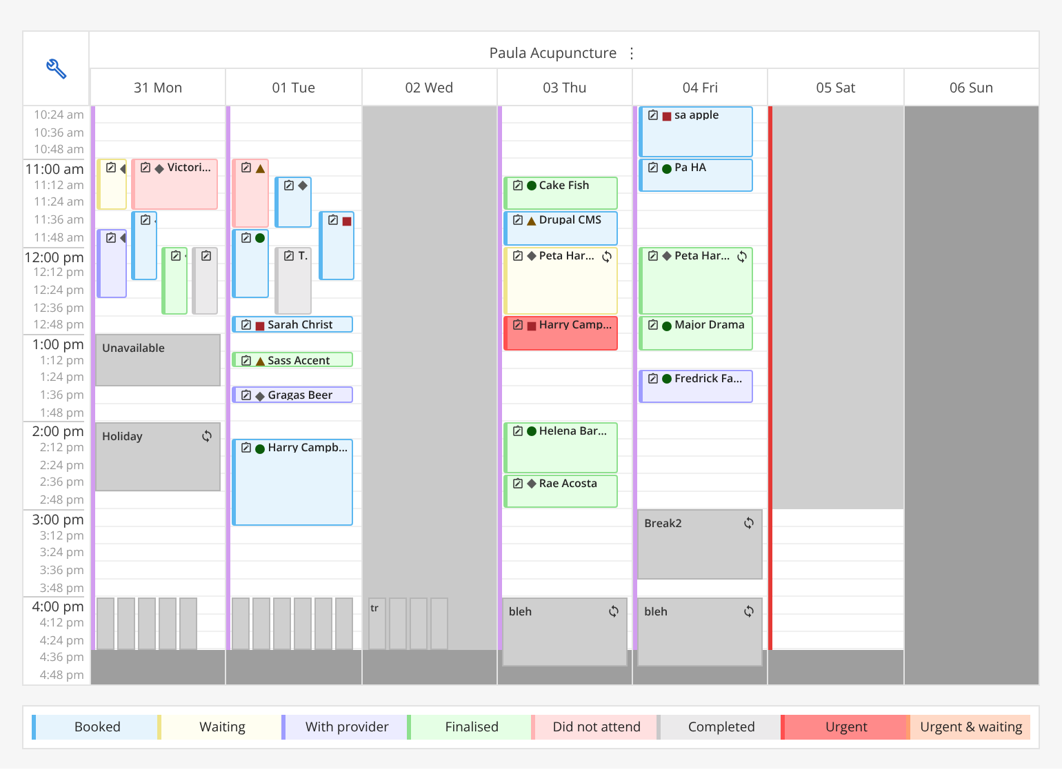
Colourblind users of our appointment book told us the colours of patients' SMS replies were imperceptible. Replies were shown as a small traffic light on each appointment tile, and keeping the design "like for like" with the legacy appointment book hadn't supported colourblind users.
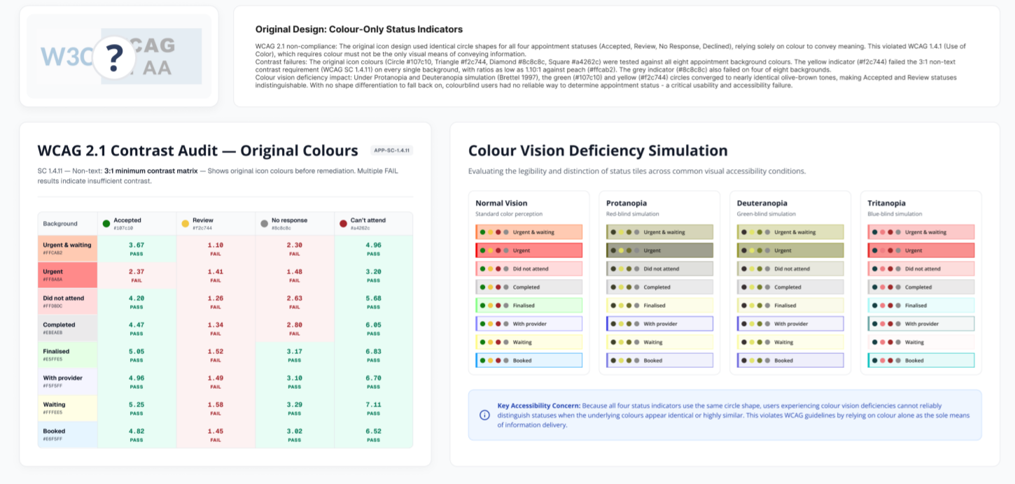
- Colour was the only differentiator. Every status used the same circle. Under protanopia and deuteranopia simulation, Accepted and Review turned the same olive-brown.
- Contrast failed WCAG 2.1. The yellow indicator failed the 3:1 non-text contrast requirement on every one of the eight appointment backgrounds, at worst 1.10:1. The grey failed on four of eight.
- A constraint: users liked the familiar appointment colours, so the fix had to keep them.
What I did
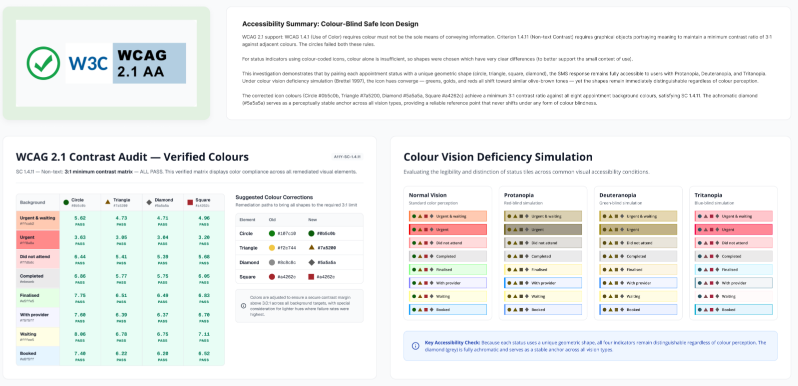
I audited the appointment book against WCAG to find where to improve, then built a contrast matrix of every status colour against every appointment background and simulated protanopia, deuteranopia and tritanopia (Brettel 1997).
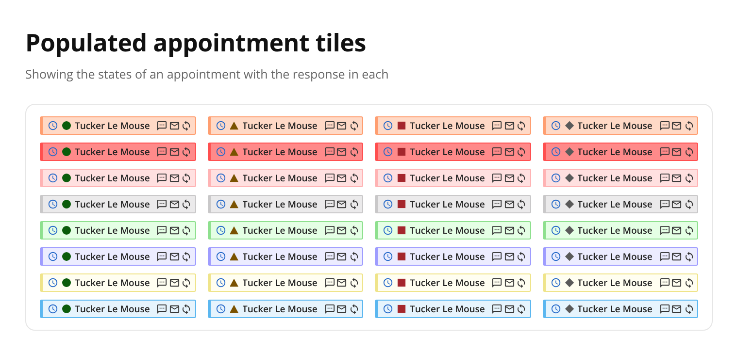
I gave each reply its own shape (circle, triangle, square and diamond), chosen to be clearly different at the small size of a tile, and corrected the colours so every one passes. The grey diamond has no hue at all, so it looks the same to everyone and anchors the set.
Outcome
Every indicator meets 3:1 against all eight backgrounds, meeting WCAG 2.1 success criteria 1.4.1 (use of colour) and 1.4.11 (non-text contrast). Statuses stay distinguishable for colourblind users, even on a busy appointment book. The new indicators are now live in the appointment book.
How I'd use AI now
This project was done before AI tools were part of my process. If I did it today:
- Automate the contrast matrix and colour vision simulations, so every new status colour or icon is checked the moment it's added, not just once in an audit.
- Use AI to prepare an assisted WCAG review of the whole appointment book, then confirm the findings by hand and with the users who rely on them.
- Generate the shape-and-colour test sheet automatically, so changes can't break accessibility unnoticed.