Two places patients got stuck
Patients were getting stuck at two points in online booking. At the start, user feedback showed frustration with clinics that weren't taking new patients online. At the end, analytics and Hotjar showed drop-offs on the confirmation step.
1. Booking entry
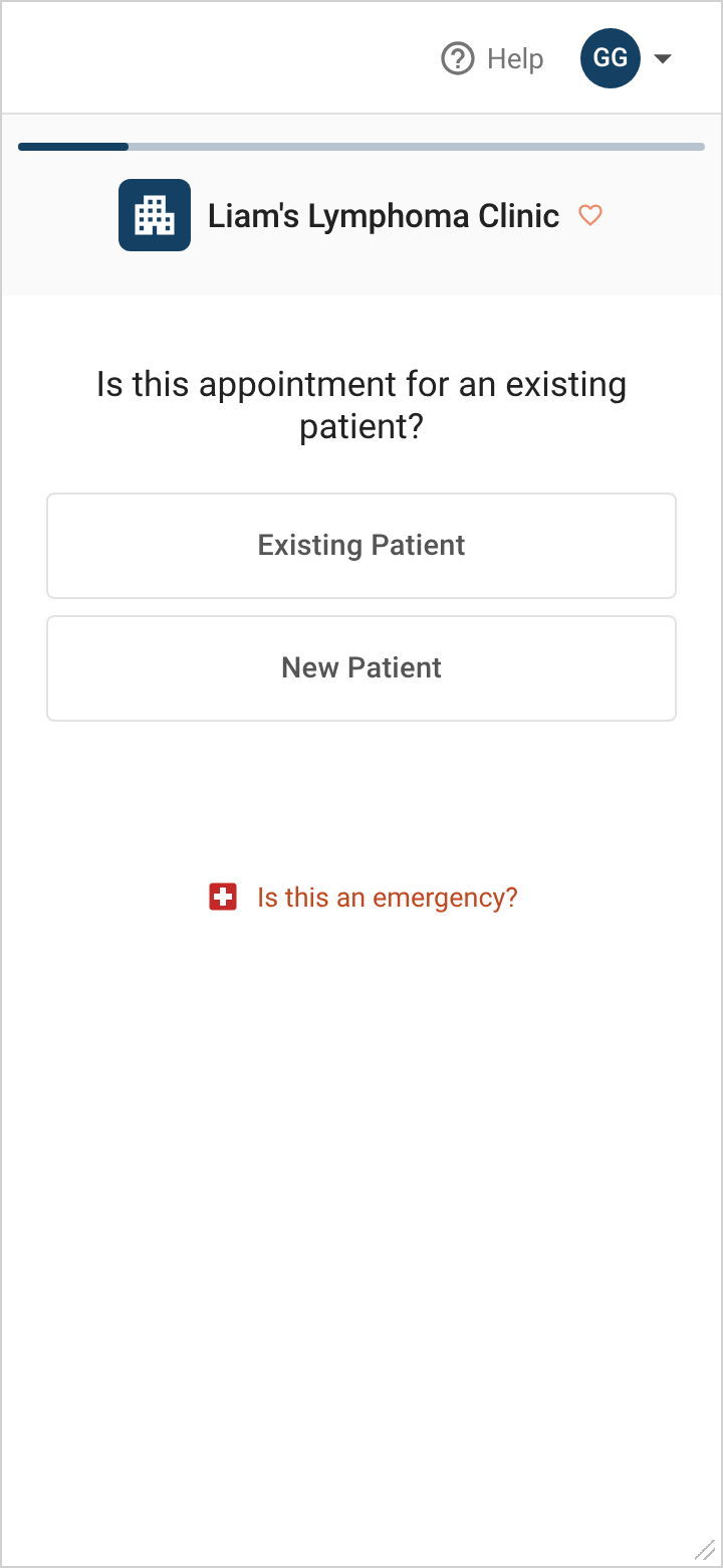
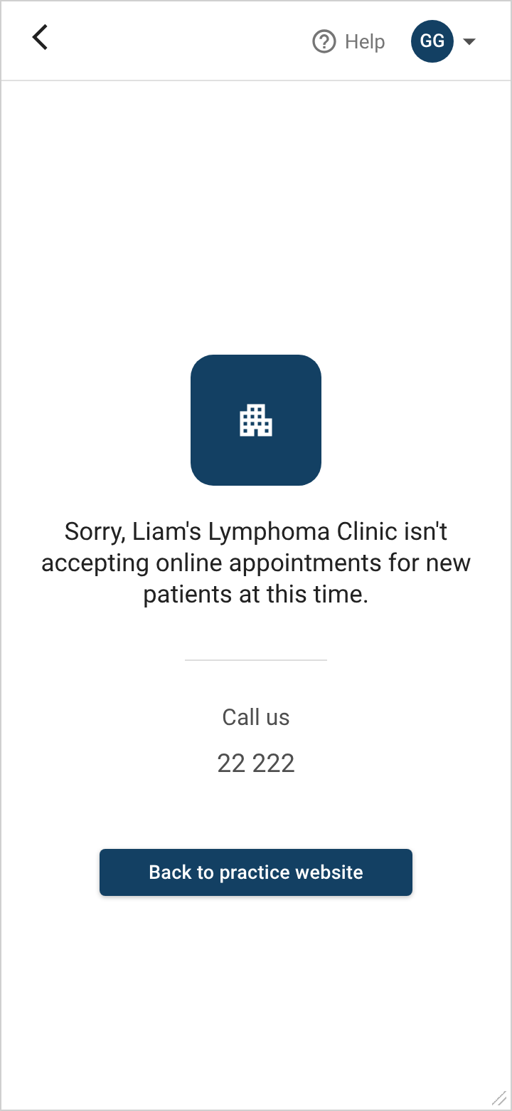
Booking starts by checking whether a clinic is open to new patients. The old flow didn't make that clear: patients didn't find out a clinic wasn't taking new patients online until a second screen. Feedback was that these two-click denials were frustrating. The wording also discouraged patients from calling the clinic instead, so they didn't follow up.
Before
After
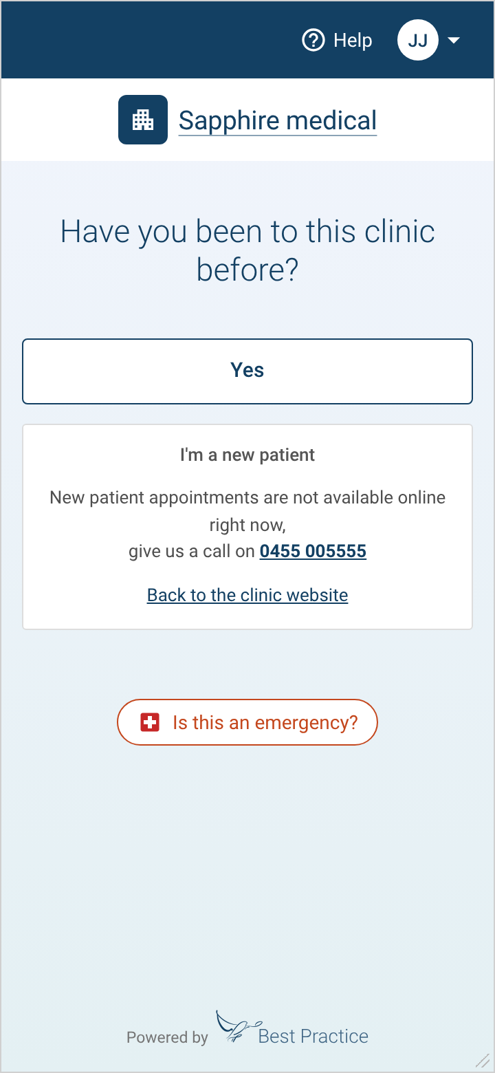
- Removed the second page. Patients see straight away whether they can book, with fewer clicks and less frustration.
- Plain language. "Have you been to this clinic before?" replaces "Is this appointment for an existing patient?", removing jargon.
- Solutions first. New patients get the clinic's phone number and a link back to its website, encouraging them to call.
2. Booking confirmation
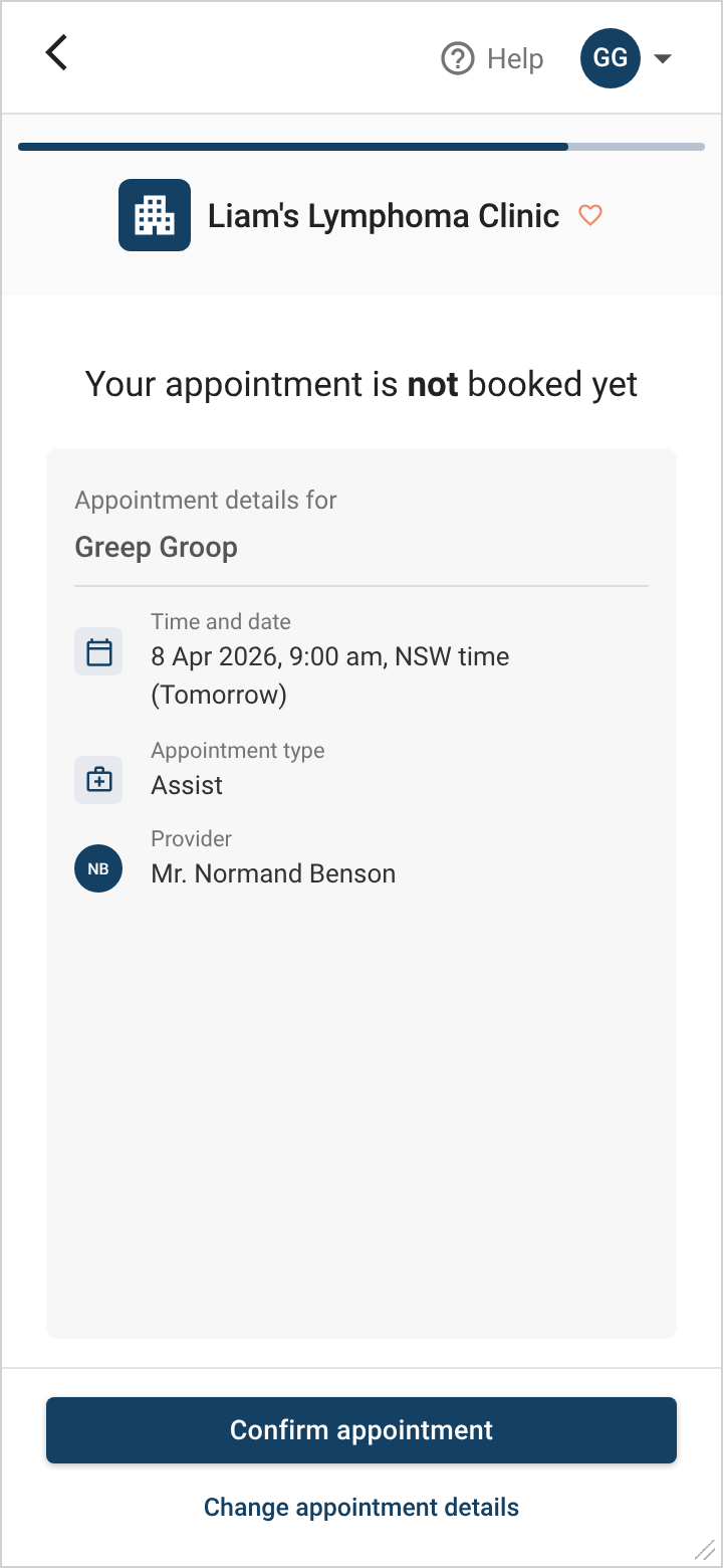
Before an appointment is made, patients check their details. Many didn't realise this was a confirmation page: they read "Your appointment is not booked yet" as done, and left. The two buttons at the bottom were also easy to misclick.
Before
After
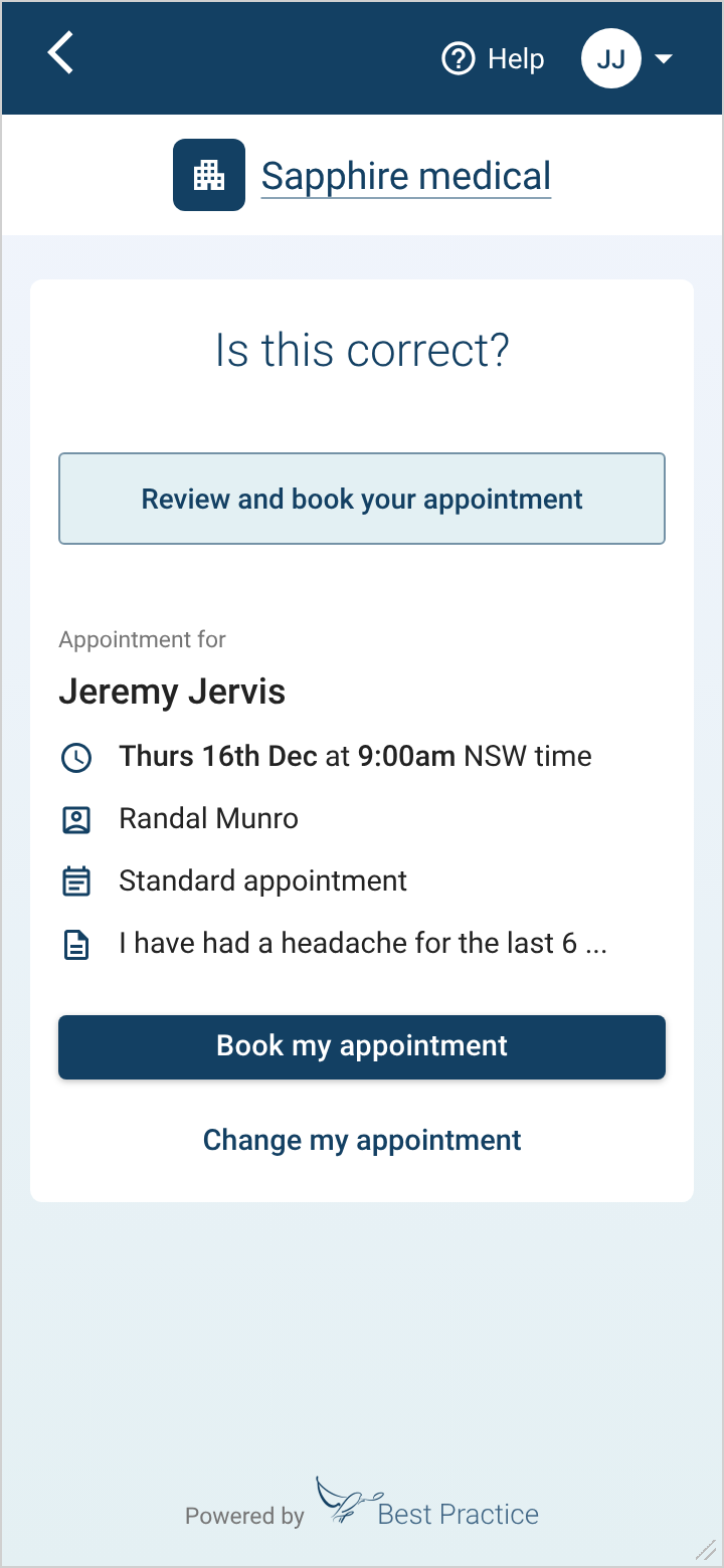
- A clear warning. A "Review and book your appointment" panel stands out and draws attention.
- Less to read. Clearer icons and larger text replace the field titles, reducing mental load.
- Buttons moved. Placed with the appointment, which reduces "autoclicks" and links the action to what's being booked.
Outcome
These changes were part of the booking and onboarding redesign that removed 2 steps and reduced drop-offs.
How I'd use AI now
This project was done before AI tools were part of my process. If I did it today:
- Have AI watch the analytics for unusual drop-off at each step, so problems surface in days rather than at the next review.
- Generate and compare many versions of the "not accepting new patients" and "not booked yet" messages, then A/B test the best two.
- Check every screen against plain-language guidelines and reading level as part of each release.